
How to Build a Personal Work Dashboard with Copilot Cowork
Build a personal AI work dashboard with Copilot Cowork that continuously pulls from your calendar, inbox, Teams, and OneDrive to help you prioritize your day automatically.
MICROSOFT 365 COPILOTANTHROPIC CLAUDECOPILOT COWORK
5/23/20269 min read
Why I Built This
Most workdays start like digital pinball.
Outlook. Then Teams. Then Calendar. Then OneDrive. Then back to Outlook because something else just came in. By 10 AM, you are not really working anymore. You are just switching contexts faster.
Meanwhile your brain is trying to track: overdue action items, meetings that need prep, people waiting on responses, active projects, unread chats, calendar overload, who is out of office, and what actually deserves your attention right now.
The problem is not lack of information. It is fragmentation.
So I wanted a single place that continuously answers one question: what deserves my attention right now?
That became this dashboard.
What the Dashboard Actually Does
The dashboard is a single self-contained HTML page generated by Copilot Cowork using live Microsoft 365 data.
It pulls from your calendar, inbox, Teams, and OneDrive, then turns that raw activity into a structured view of your day and week.
Each morning it generates automatically and lands in your inbox as a ready-to-open HTML file. Throughout the day, it refreshes hourly so the view stays current without any manual effort.
Instead of bouncing between apps, it surfaces: meetings that need preparation, emails that actually require replies, unread Teams conversations that need your attention, active projects with inferred next actions, upcoming deadlines, calendar load across the week, teammates who are out of office, and recent files you are actively working on.
Everything is clickable and opens directly back into Outlook, Teams, or OneDrive.
A Few Things Worth Seeing in the Video
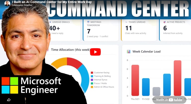
The walkthrough shows the dashboard in real use, not just as a static build. You’ll see how it surfaces priorities in real time, how the layout changes the way you interpret your day, and how quickly it turns scattered work signals into something actionable.
A few of the most useful moments are easier to understand visually than through text alone — especially how the prioritization actually feels when you’re using it live, and how seamlessly it connects back into Outlook and Teams.
How to Build It - Dashboard Recipe
This is the exact recipe used in the video. Simply copy/paste everything between START COPYING to STOP COPYING into a new Copilot Cowork task and watch the magic happen!
--- START COPYING
Using the info here, generate a personal dashboard for me.
# Personal Work Dashboard — A Recipe for Microsoft Copilot (Cowork)
A self-contained, single-page HTML dashboard that pulls live signal from your calendar, inbox, Teams chats, and OneDrive — and refreshes itself hourly during the workday. Every item on the page is clickable and opens the source in Outlook, Teams, or OneDrive.
This file is a hand-off recipe. Open Cowork in Copilot, paste the prompts below in order, and you'll end up with the same dashboard.
---
## What you'll get
A file at `output/dashboard.html` that contains:
- Header — greeting with the current date, a "Last refreshed" timestamp, and a hint that everything is clickable
- KPI strip — six tiles at a glance: overdue actions, unread emails, meetings tomorrow, Teams unread, active projects, OOF this week
- Urgent banner — red-bordered block surfacing the things that need attention today (overdue access renewals, expense deadlines, fresh alerts)
- Tomorrow's Schedule — every event for tomorrow, with response status, organizer, conflicts, and prep flags
- Prep Notes — short crib sheets for the meetings that need them (customer demos, manager 1:1s, conflict resolutions)
- Top Projects — your top 5–8 active projects inferred from cross-source signal, each with a "Next" item
- Week Calendar Load — pure CSS bar chart of meeting count per day for the upcoming week (gradient-filled `<div>` bars — no charting library)
- Time Allocation — pure CSS doughnut chart breaking the week by category (customer-facing, training, internal syncs, focus, admin) — rendered with `conic-gradient`, no charting library
- Emails Needing a Reply — the ~5–10 messages that actually want a response, with everything else filtered out
- Long-Term Action Items — overdue tasks, weekly deadlines, upcoming milestones
- Training & Learning — upcoming training sessions and skilling events
- OOF Radar — teammates out of office this week and next, with a flag if any of them organize a meeting you're attending
- People to Follow Up With — direct mailto / Teams chat links
- Unread Teams Chats — top unread chats with a one-line preview
- Recent Files in Flight — most recently modified OneDrive folders
- Footer — refresh schedule note
The page renders on a soft blue gradient background with rounded white cards, a Microsoft-y `#0078d4` accent, and color-coded badges (green = accepted, amber = tentative, red = needs response).
### Premium visual touches
- Dark mode toggle — pill button top-right of the header; sun/moon icon; preference persisted in `localStorage`. Implemented via CSS variables under `:root` and `[data-theme="dark"]`. The urgent banner must also be theme-aware — define `--urgent-bg`, `--urgent-heading`, `--urgent-item-bg`, `--urgent-item-hover`, `--urgent-watermark` in both `:root` (light: soft red gradient `#fee2e2 → #fecaca`, white item cards, `#991b1b` heading/watermark) and `[data-theme="dark"]` (dark: muted red gradient `#3f1d1d → #4c1d1d`, slate item cards `#1e293b`, `#fca5a5` heading/watermark). The `.urgent-banner`, `.urgent-banner::before`, `.urgent-banner h2`, `.urgent-banner li`, `.urgent-banner li a:hover`, and `.urgent-banner li strong` rules must use `var(--urgent-*)` rather than hardcoded `#fee2e2` / `#ffffff` / `#991b1b` so the section adapts when dark mode is toggled.
- Static-first KPI tiles — each tile renders its final value directly in the HTML (e.g. `<div class="kpi-value">22</div>`), so the number is visible even when scripts are disabled. Any count-up animation must be additive: add it via CSS `@keyframes` or a small inline script that gracefully no-ops if blocked. Do not initialize the tile text to `0` and rely on JS to populate the real number — preview environments and email viewers that strip scripts will show empty/zero tiles.
- Slide-up entrance animations — KPI tiles and cards fade up on load with staggered delays (pure CSS `@keyframes`, no JS).
- 3-color header gradient — `#0078d4 → #00bcf2 → #5e60ce` with radial-gradient overlay highlights.
- Pulse dot on the "Last refreshed" timestamp (pure CSS `@keyframes`, no JS).
- CSS gradient bar chart for Week Calendar Load — built from flex-aligned `<div>` bars whose heights are inline `style="height: NN%"` percentages and whose fills use `linear-gradient`. Red gradient on heavy days (≥7 meetings), gray for light days (=2), blue otherwise. Do not use Chart.js, D3, or any external charting library — they require JavaScript and a working CDN, both of which fail in sandboxed previews and email-attachment viewers.
- CSS conic-gradient doughnut for Time Allocation — render the chart as a `<div class="donut">` whose background is a `conic-gradient(color1 0deg Adeg, color2 Adeg Bdeg, ...)` with a `::after` pseudo-element using the card background color to punch out the hole. Pair it with a static HTML legend showing each category's percentage. No Chart.js, no canvas, no JS.
- Project health dots — red (hot), green (active), amber (watch) next to each project name, with soft glow.
- Avatar initials circles on the People to Follow Up card — five gradient backgrounds (avatar-1 through avatar-5).
- Decorative `⚠` watermark in the urgent banner.
---
## How to build it — paste these prompts into Cowork, in order
### Prompt 1 — build the dashboard
```
Build me a personal work dashboard as a single HTML file at output/dashboard.html.
Gather fresh data in parallel from across my Microsoft Graph:
1. Calendar — today's remaining events and the next 7 days, including response status, organizer, and online-meeting status
2. Inbox — unread, flagged, and high-importance messages from the last few days
3. Teams — unread chats with last-message previews
4. OneDrive — recently modified folders in my personal drive
5. Search M365 for any action-required emails (access renewals, expense reminders, training notices)
Infer my top 5–8 active projects by clustering recurring meetings, email threads, and customer names. Surface a "Next" action for each.
Render a single-page HTML dashboard with this layout:
- Header: greeting with today's date, last-refresh timestamp (Pacific time), "Click any item to open it" hint
- KPI strip (6 tiles): overdue actions, unread emails, meetings tomorrow, Teams unread, active projects, OOF this week. Color the urgent ones red, warnings amber, healthy ones green.
- Urgent banner (red-bordered): items that need attention today
- Tomorrow's Schedule card: every event with time chip, title, response badge, organizer, conflict markers
- Prep Notes card: short crib sheets for meetings that need prep
- Top Projects card: inferred projects with a "Next" line each
- Week Calendar Load: pure CSS bar chart of meeting counts per day for the upcoming week (flex-aligned `<div>` bars with `linear-gradient` fills and inline `style="height: NN%"`)
- Time Allocation: pure CSS doughnut chart splitting the week by category (`<div>` with `conic-gradient` background and a `::after` hole, paired with a static legend)
- Emails Needing a Reply card: the few messages that actually want a response — filter out newsletters, alerts, external pitches
- Long-Term Action Items card: overdue tasks, weekly deadlines, upcoming milestones
- Training & Learning card: upcoming training sessions
- OOF Radar card: teammates out this week & next, with a heads-up if any organize a meeting I'm attending
- People to Follow Up With card: name + one-line context
- Unread Teams Chats card: top chats with one-line previews
- Recent Files in Flight card: most recently modified OneDrive folders
- Footer: refresh schedule note
Visual style: soft blue gradient background (#f5f7fa to #e8edf3), rounded white cards with subtle shadow, 'Segoe UI' font, Microsoft accent #0078d4, color-coded badges (green #dcfce7/166534 = accepted, amber #fef3c7/92400e = tentative, red #fee2e2/991b1b = no response or overdue, purple #ede9fe/5b21b6 = organizer). Use a 2-column grid for the main sections, 3-column for the smaller cards, collapsing to single column under 1024px.
PORTABILITY REQUIREMENT — the file must render correctly with zero external network requests and zero JavaScript executing. No `<script src="…">` to any CDN. No Chart.js, D3, or other charting libraries. No external fonts (use the system 'Segoe UI' stack). All charts must be built from HTML + CSS only: bar chart = flex-aligned gradient `<div>` bars; doughnut = `conic-gradient` background with a `::after` pseudo-element hole. All KPI tiles must render their final value directly in the HTML — never start at `0` and rely on JS to fill in the number. Any animation or interactivity (slide-up entry, pulse dot, dark mode toggle) is allowed but must be additive: CSS-driven where possible, and any inline script must gracefully no-op if blocked (e.g. wrap `localStorage` access in `try/catch`). The dashboard will be opened in sandboxed previews, email-attachment viewers, and locked-down browsers where scripts and CDNs frequently do not run.
Premium touches to include (all must work without JavaScript or external requests):
- Dark mode toggle in the header (pill button with sun/moon icon, CSS-variable theming). Persist preference via `localStorage` wrapped in `try/catch` so it gracefully no-ops where storage is blocked. The page must render correctly in light mode by default even if the toggle script never runs.
- KPI tiles render their final value directly in the HTML (e.g. `<div class="kpi-value">22</div>`). Optional polish: a CSS-only entry animation (e.g. `@keyframes` opacity/translate). Do not start the tile text at `0` and rely on JS to count it up — that breaks in any context where scripts don't execute.
- Slide-up entrance animation on KPI tiles and cards via pure CSS `@keyframes`.
- 3-color header gradient (#0078d4 → #00bcf2 → #5e60ce) with radial-gradient overlay highlights.
- Pulse dot animation on the "Last refreshed" timestamp via pure CSS `@keyframes`.
- CSS bar chart for Week Calendar Load — `<div>` columns whose heights are inline `style="height: NN%"` percentages. Fill classes: `.heavy` (red `linear-gradient` when count ≥ 7), `.light` (gray when = 2), `.normal` (blue otherwise). Number labels sit at the top of each bar in white text.
- CSS doughnut for Time Allocation — `<div class="donut">` with `conic-gradient(...)` background, segment angles computed at build time from the percentages, and a `::after` pseudo-element using the card background color to punch out the center hole. Render the legend as static HTML next to it.
- Project health dots next to each project name — red (hot), green (active), amber (watch), with a soft box-shadow glow.
- Avatar initials circles on the People card (avatar-1 through avatar-5 with gradient backgrounds).
- Decorative ⚠ watermark in the urgent banner using a `::before` pseudo-element.
CRITICAL — every item must be clickable. Wrap every event, email, chat, file, project card, training item, action item, and person in an <a href="..." target="_blank"> anchor tag:
- Calendar events → fetch via QueryGraph on /me/calendarView with $select including webLink; use the event's webLink
- Emails → fetch via QueryGraph on /me/messages with $select including webLink; use the message's webLink
- Teams chats → fetch via QueryGraph on /me/chats with $select including webUrl; use the chat's webUrl
- OneDrive folders → use the item's webUrl
- People → mailto:<email> for email follow-ups, or the 1:1 chat webUrl for Teams follow-ups
- Project cards / training items without a canonical link → use an Outlook inbox search URL like https://outlook.office.com/mail/inbox?searchquery=<keyword>
Style anchors with class names so they look like regular cards (color: inherit; text-decoration: none; display: block or flex; subtle hover background).
Save to output/dashboard.html. After writing, confirm the file exists in output/.
```
### Prompt 2 — schedule the hourly refresh
```
Set up a scheduled task that refreshes output/dashboard.html every weekday at :55 past the hour, from 6:55 AM through 5:55 PM Pacific. Use the same data-gathering and rendering instructions from the dashboard we just built — capture webLink/webUrl for every item so links stay clickable on every refresh.
At the 6:55 AM run only (and no other hour), also send me an email:
- To: <my email address>
- Subject: "Your Daily Work Dashboard — [today's date in M/D format]"
- Body: brief greeting noting the dashboard is attached, every item is clickable, and the in-session version refreshes hourly
- Attachment: output/dashboard.html
For all other hours, refresh the file silently — no email.
Name the task "Refresh work dashboard (hourly at :55, email at 6:55 AM)".
```
--- STOP COPYING
## Notes for whoever you're sharing this with
- Cowork access required — these prompts assume Microsoft Copilot Cowork with Outlook, Calendar, Teams, OneDrive, and scheduled-task tools enabled.
- First run takes ~1–2 minutes — the agent fans out parallel Graph queries, infers projects, and renders the HTML.
- The hourly refresh edits the same file in place — `output/dashboard.html` is overwritten, not duplicated.
- Editing the scheduled task pauses it — after any prompt that asks Copilot to modify the task, resume it from the task list in Cowork.
- Personalization — the dashboard reflects whoever's signed in. Customer names, project clusters, and urgent items all come from that user's own data; nothing is hard-coded.
- Lock the layout — once you're happy with the look, tell Copilot "lock this dashboard format in for all future ones." That updates the scheduled task so every hourly refresh preserves the approved layout, CSS, and premium visual touches. Editing the scheduled task pauses it — resume from the Cowork task list when you're ready for the next refresh.
--- END
Watch the Full Walkthrough First
Before copying anything below, watch the video walkthrough first.
This blog contains the starter recipe, but the video shows how the dashboard actually behaves inside real workflows, how priorities are inferred, and why the system works the way it does in practice.
That context makes everything below easier to understand and actually use.
Contact Us
Questions? Reach out anytime.
Phone
© 2020–Present Collaboration Simplified. All rights reserved.
Collaboration Simplified® is a registered trademark of Shervin Shaffie.